CENACED
Leads the platform operation and keeps the learning experience connected to local resilience needs.
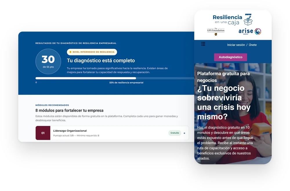
An online learning platform created to transform lives through education, helping small and medium-sized businesses build resilience by learning how to prepare for, manage, and recover from disasters.
Despite the platform's solid foundation, the experience lacked design consistency, clear communication, and a user journey capable of explaining how the platform worked or how users could gain value from it. The homepage failed to guide first-time visitors, and users were not progressing through the learning funnel, revealing the need to redesign the experience to make the platform's purpose, navigation, and value immediately understandable and trustworthy.
Leads the platform operation and keeps the learning experience connected to local resilience needs.
Develops the resilience learning content and translates technical knowledge into practical modules for SMEs.
Supports the initiative and reviews impact metrics to understand how the work improves people's lives.
How many people reach the platform and enter the learning funnel.
How many users complete the first measurable resilience action.
How many users move from assessment into learning and capability building.
How many users finish the material and claim the completion incentive.
This profile is built from 228 self-assessment registrations collected across three CENACED workshop programs between September 2025 and May 2026. Demographic data — age, gender, business type, location — came directly from program intake forms. Digital behavior and arrival context were derived from GA4 analytics and workshop referral patterns shared by CENACED and ARISE Mx.
A micro-business owner with limited digital experience, a concrete disaster risk, and no prior exposure to structured online learning platforms.
The platform had no logo. No color palette. No deliberate typographic decisions. A webinar was scheduled for Monday — the first public-facing event under the Resiliencia en una Caja name — and there was nothing to show behind it. That deadline became the forcing function.
I designed a logo mark built on the platform's core idea: a box containing structure, a key suggesting access. The wordmark used Montserrat for the platform name and Helvetica for supporting text. The palette — blue, magenta, lilac — was chosen to signal institutional credibility without feeling academic. From that work I produced a brand manual that could be handed to any collaborator and keep the visual language consistent. The purchased theme became a starting point to move away from, not a final answer.

For headers, blue backgrounds, and materials with a dark institutional surface.
For campaign pieces on magenta backgrounds. Contrast should be checked before print.
For printed and digital materials on white or light backgrounds.
IA, trust signals, and one clear CTA to start the self-assessment.
13 steps across the three resilience pillars. Progress bar visible throughout.
Pillar breakdown shows where the business is strong and where it is exposed.
Score-driven recommendations surface the most relevant courses first.
Completion unlocks a coupon — proof of progress and incentive to finish.
Users who leave mid-assessment — tracked in GA4 as incomplete form starts.
Mailchimp sequence re-surfaces the platform and invites the user back to complete.
Every major decision in the redesign traces back to something specific in the data — a demographic pattern, a behavioral signal, or a gap between what the platform offered and what the user actually needed.
Workshop registrations showed a predominantly female audience in mid-career, running micro-businesses in retail and food service.
Users arrived from in-person workshops with basic digital comfort. Multi-page forms were likely outside their typical online experience.
Every recorded user arrived through a CENACED program or institutional partner. The platform had no meaningful organic search traffic — awareness was entirely relationship-driven.
The three workshop programs were each built around a named risk — earthquake, extreme heat, flooding. Users registered because that risk was already present in their lives, not as an abstract exercise.
The hero copy was rewritten from a grant-report mission statement into a direct question in everyday Spanish — benchmarked against how a shop owner would talk about their business, not how a risk consultant would.
The self-assessment was rebuilt with a visible progress bar, one topic per step, and each section labeled by resilience pillar — reducing cognitive load and making the end feel reachable from the start.
The homepage opens with the UPS Foundation, CENACED, and ARISE Mx logos before any other content. For an audience that came through those institutions, the logos confirm they are in the right place before they read a single word.
Results are broken into three resilience pillars so a user who registered after an earthquake can see exactly which areas need attention — connecting the platform's output directly to the risk they came in with.
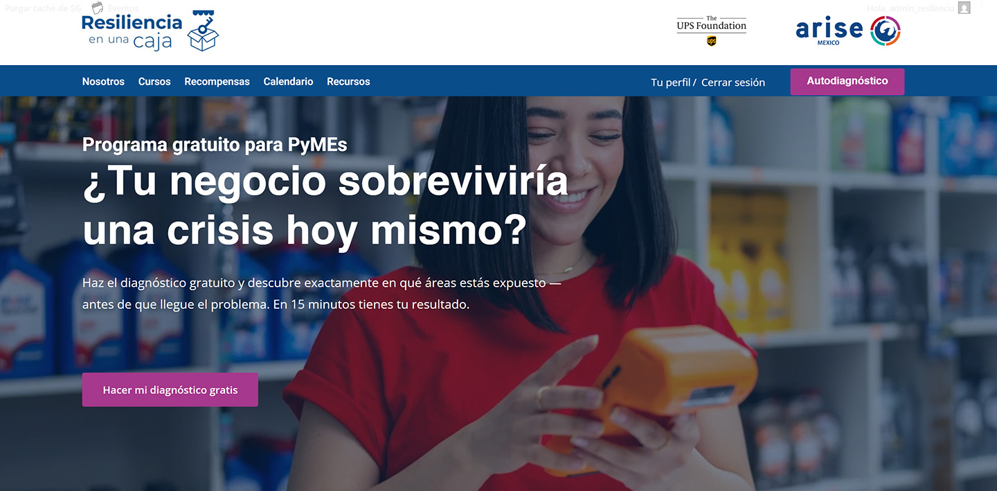
The original homepage described the platform in language written for a grant report. Technically accurate, functionally invisible. A visitor arriving for the first time had no way to understand what Resiliencia en una Caja was, why it existed, or what they were supposed to do.
The redesign was structured around three jobs: communicate purpose immediately — a direct question in the hero replacing the mission statement; establish trust — a partner logo row making the institutional backing visible on the first screen; and make the next step clear — a single CTA pointing to the self-assessment. The six resilience behaviors were rewritten from module titles into plain-language outcomes.
The self-assessment had been live for nearly a year, built in WPForms. Seventy-three people had completed it. None of them received a result. The form had expired without anyone noticing, touch targets on mobile were 23px, and there was no progress indicator — no way for a user to know how far through they were or what completing it would give them.
The rebuild moved to Fluent Forms. The questionnaire was restructured into 13 labeled steps with a visible progress bar, with each question mapped to one of the ten learning modules. The scoring logic was rebuilt so that on completion, a user receives an actual result — a percentage score per pillar, a reading of where their business is strong and where it's exposed. The form went from a dead end to the first meaningful output the platform had ever delivered.
Yes · No · Unknown
1 to 3 points per answer
Total accumulated on completion
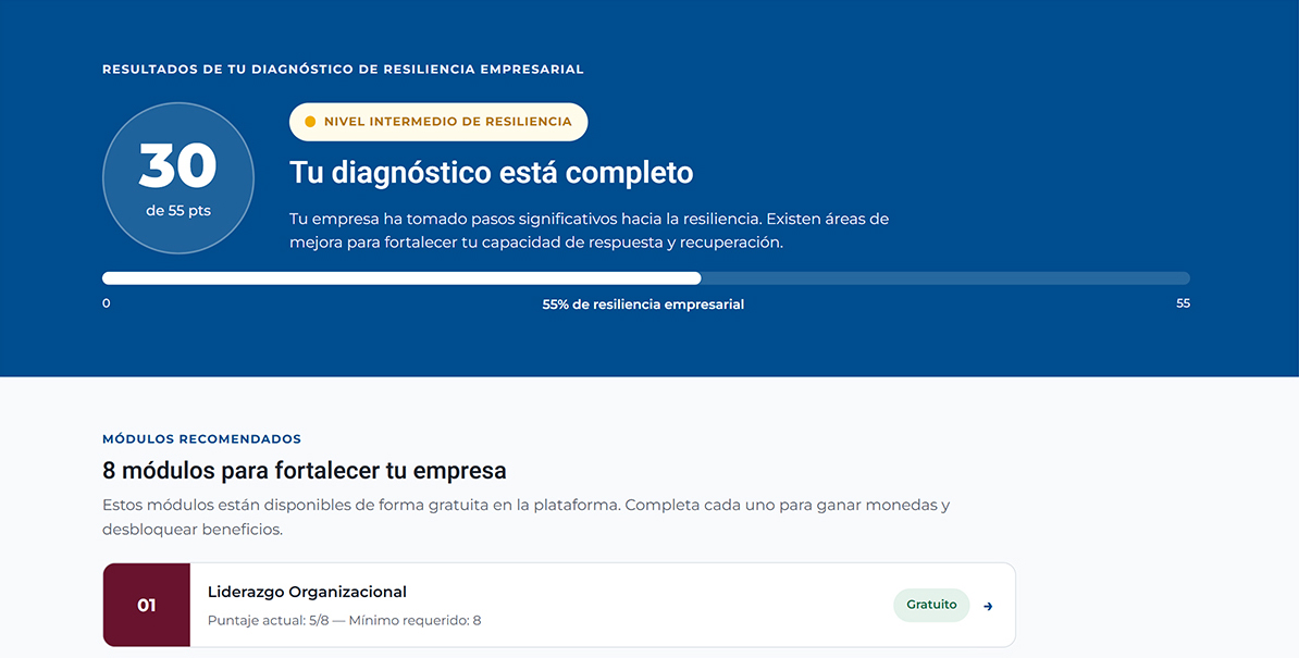
Completing the self-assessment had always felt like submitting to a void. The score page was designed to close that loop — to make the result feel earned and the next step feel obvious.
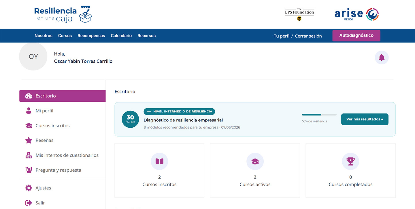
The page shows a percentage score broken down across the three resilience pillars, color-coded so a user can immediately see where their business is weakest. Below the score, a set of recommended modules surfaces — not the full catalog, but the specific ones most relevant to their result. The score page functions as a conversion mechanism: it takes the data a user just produced and turns it into a personalized starting point.
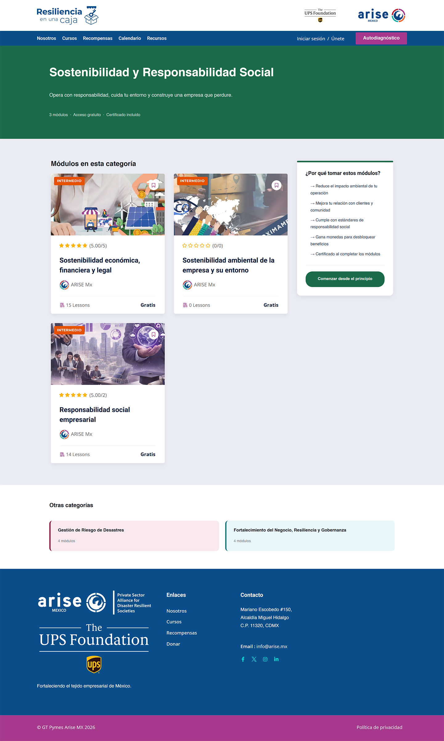
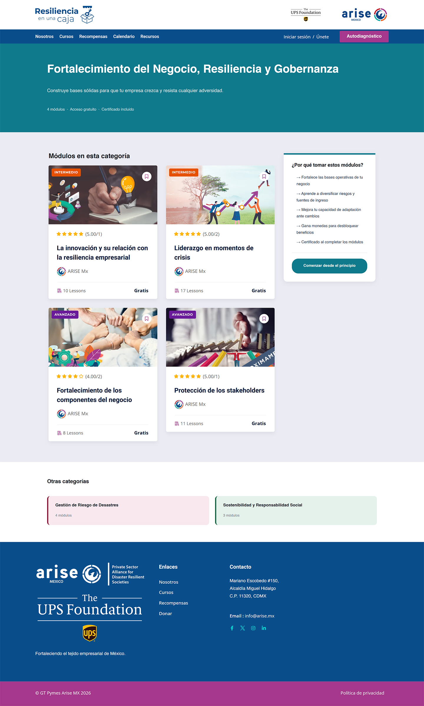
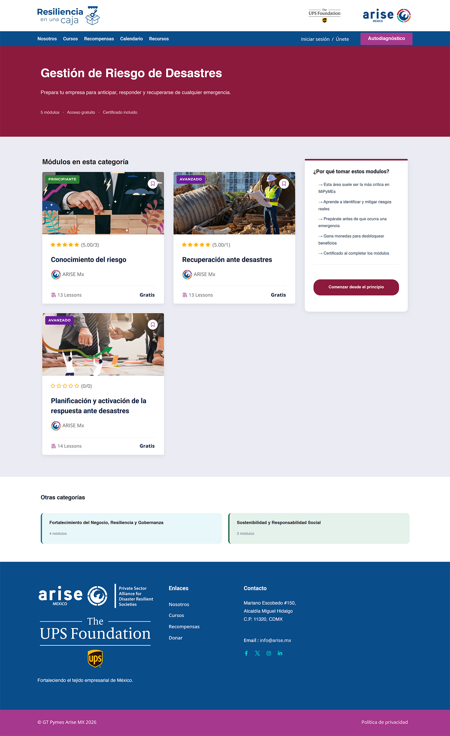
The full curriculum covers ten modules across three areas: Disaster Risk Management, Business Strengthening and Governance, and Sustainability and Social Responsibility. The challenge was making the catalog feel navigable, not overwhelming.
The self-assessment score determines which modules surface first on a user's learning path. A business that scores low on risk preparedness sees those modules prioritized. Completing a module unlocks a coupon — a small incentive that also functions as proof that someone moved through the material, not just around it.
The four metrics The UPS Foundation set as success criteria all have answers now. In the seven months since the redesign launched, 1,384 people reached the platform across 7 countries. Of those, 213 completed the self-assessment — with a 92.6% completion rate among users who started it. Sixty-three moved from their score into the learning path. Every submission produced a result. Before the rebuild, 73 had produced none.
What I'm proud of: the results screen is the first meaningful output this platform ever gave a user. It was designed and shipped without a developer. What I'd do differently: test the self-assessment with real SME owners before rebuilding it, start the brand process earlier, and redesign the course pages — the work that gets people to the learning path improved; what happens inside it is the next brief.
Reached the platform across 7 countries in the first 7 months after launch.
Every submission delivered a personalized result — the first time the platform had ever done that.
Of everyone who started the self-assessment, 9 in 10 finished it.
Users who moved from their score into a recommended course module.