En México desde 1952
Tu primera bici fue una Benotto.
La siguiente también.
Brand strategy & visual identity · Proposal
Torino 1931
México 1952
Casa de carreras
Rueda con orgullo.
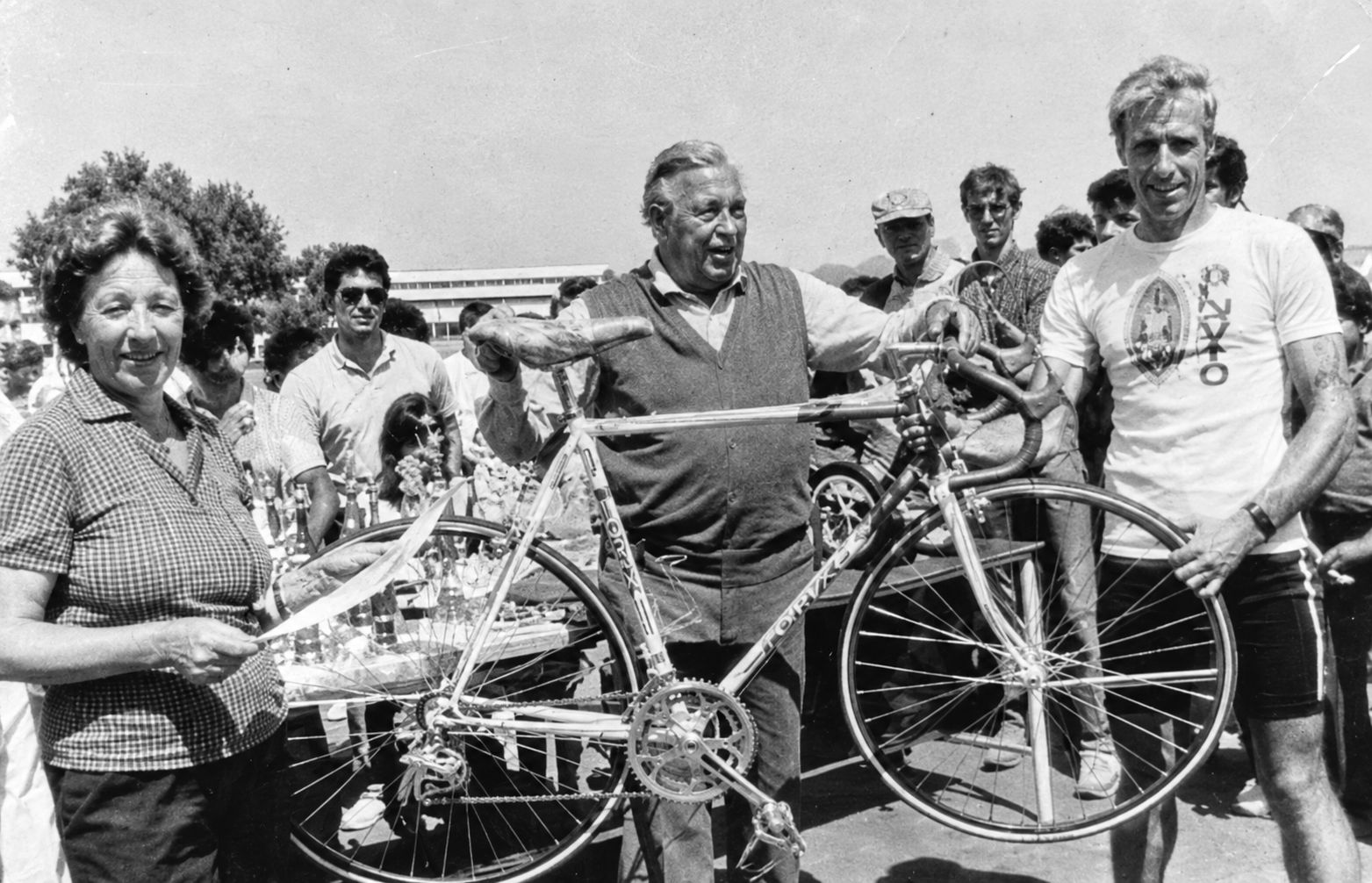
Benotto has what most brands spend decades trying to build. It was founded in Turin in 1931 by a racer, Giacinto Benotto, and moved to Guadalajara in 1952. In 1968 Ole Ritter broke the world Hour Record in Mexico City riding one of its bikes. Today it sells around a hundred models through 26 stores of its own, and it has a bigger social audience than Mercurio, the national market leader.
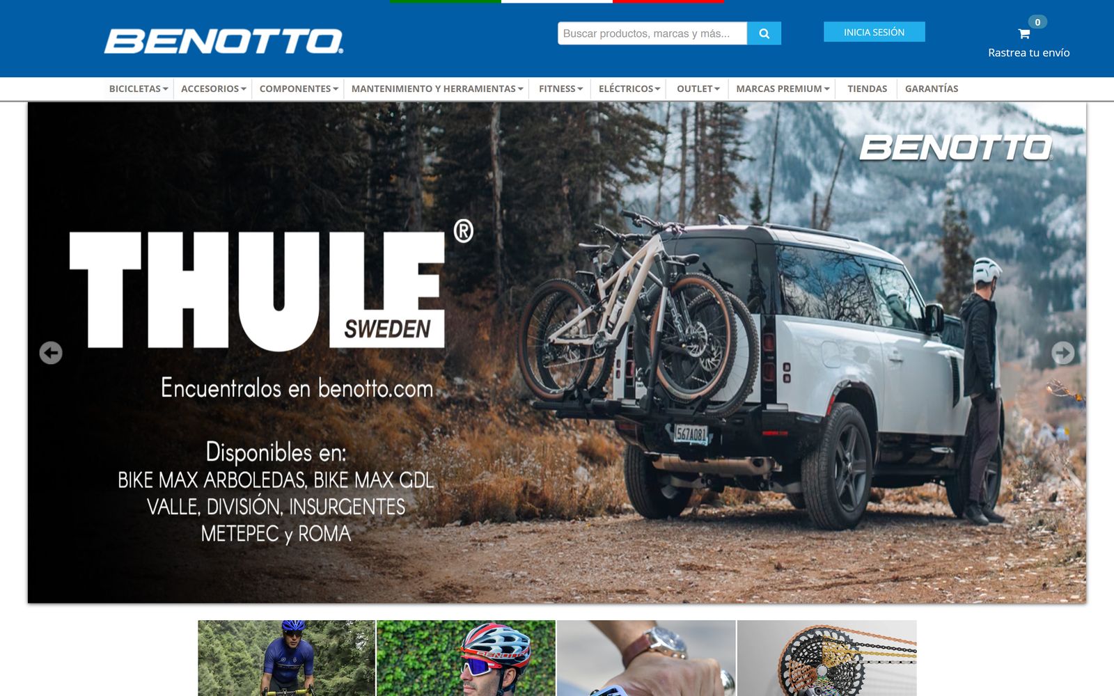
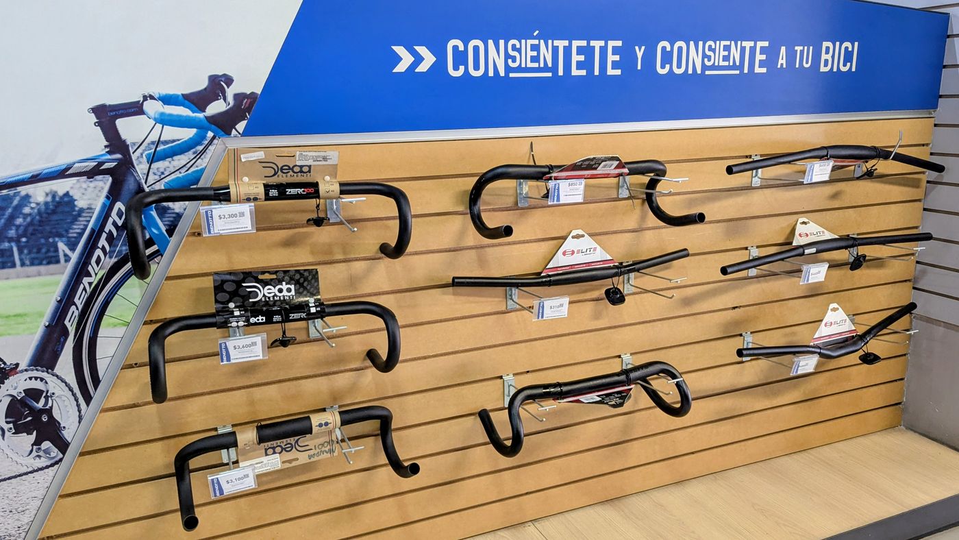
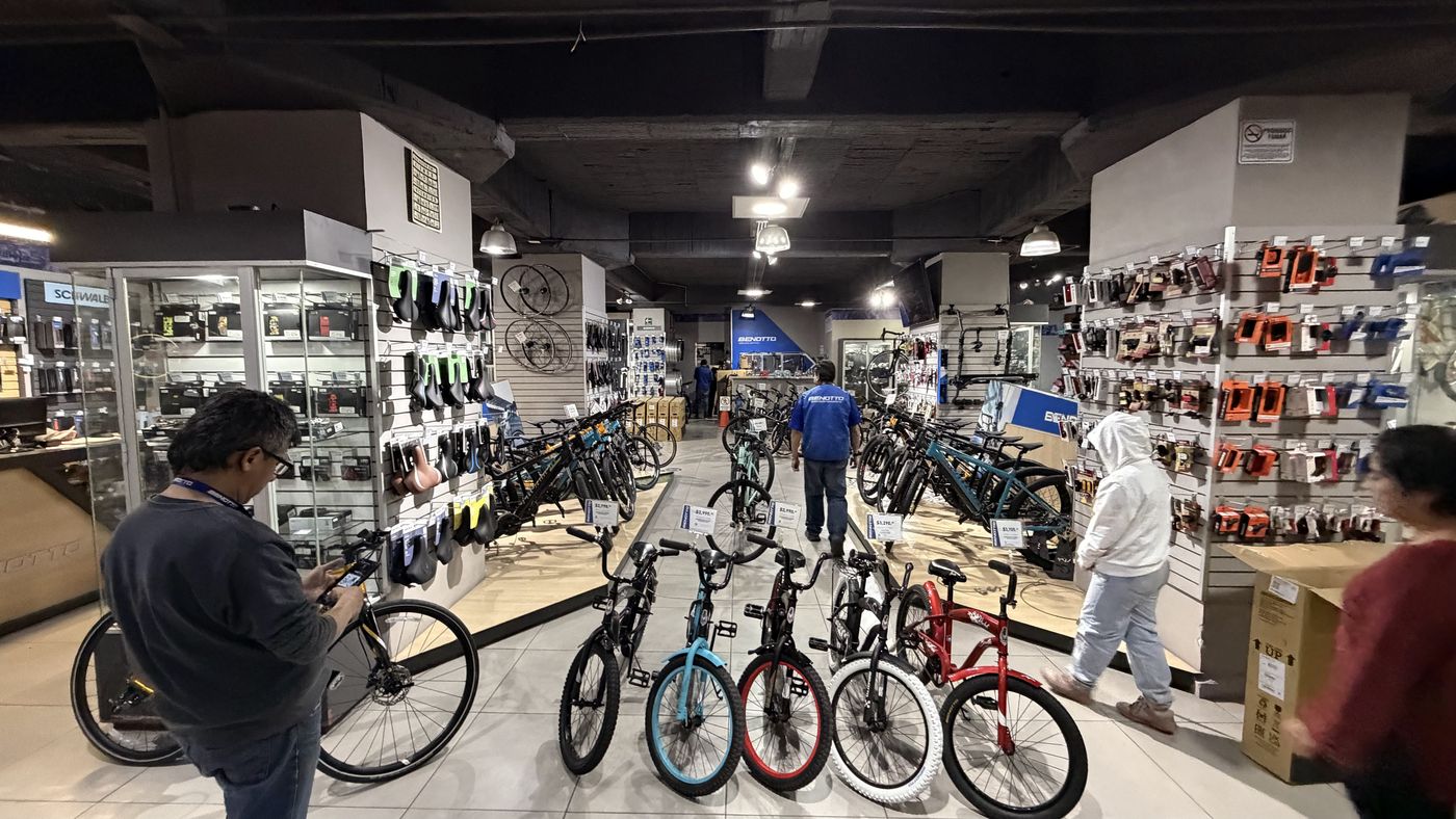
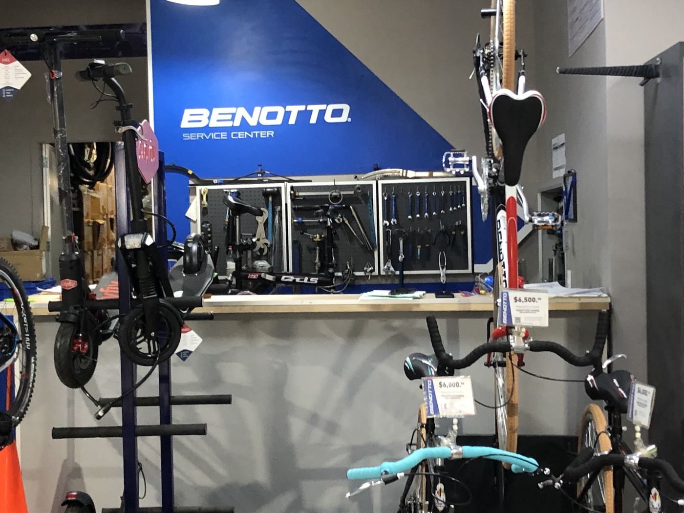
None of that reaches the customer. The audit followed a buyer’s path, from the first search to the first ride, and found a different company at every step. The problem is not a lack of assets; it is execution. Even in the stores, the blue band with white letters is the one thing people already recognise, and it hangs as an add-on sign over crowded windows.
Before the rebrand
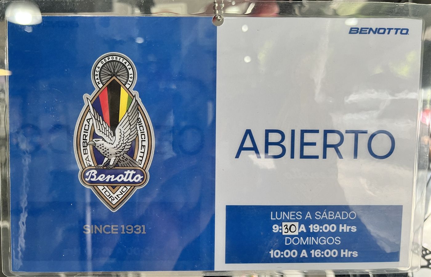

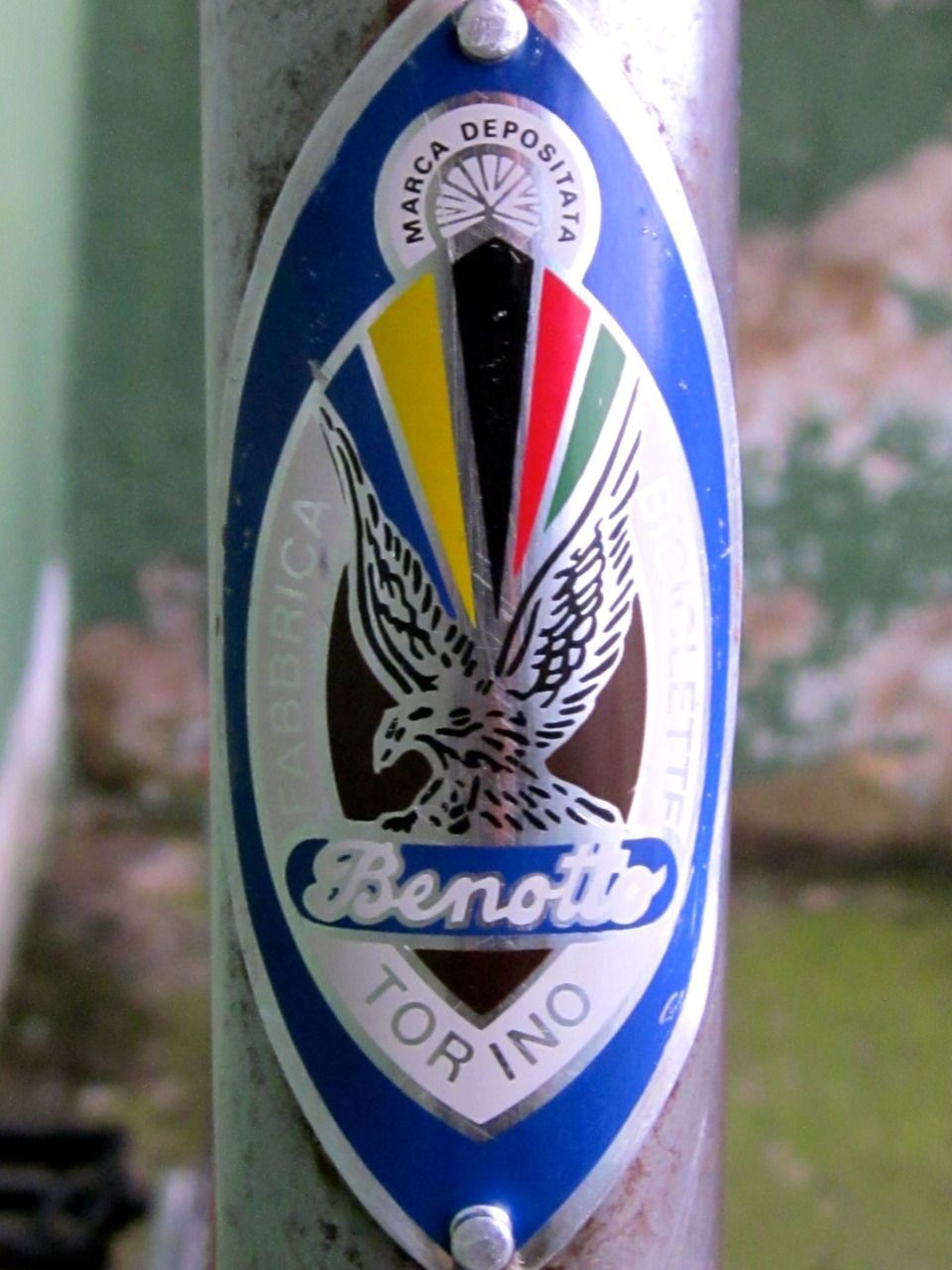
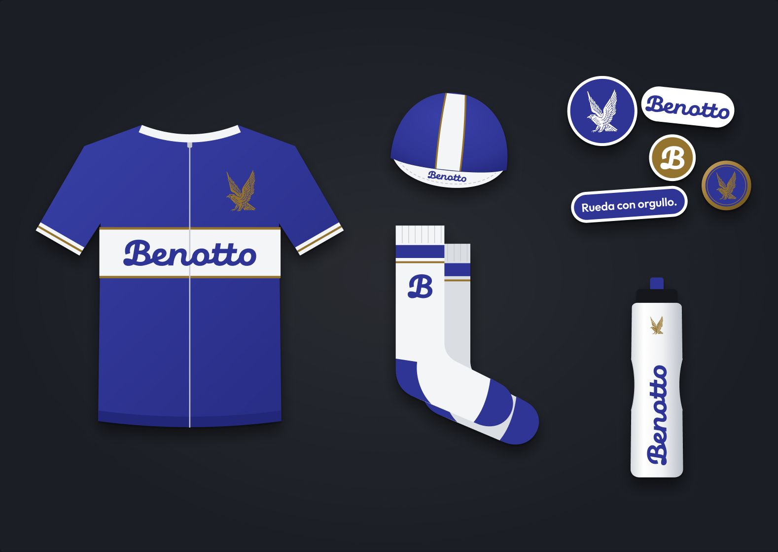
Collectors’ badges, period decals and the brand’s own anniversary pieces tell the same story: for sixty years, an eagle, the blue and a hand-drawn script. The everyday logo, an italic wordmark in use since at least 1998, is the only one that kept none of them. And for the 80th anniversary in 2011 and the 90th in 2021, the company itself went straight back to the crest.
So the new logo is recovered, not invented. The eagle is redrawn from the crest, more open and with fewer lines, so it holds up on a phone screen, over a script wordmark in Benotto Blue. Where the eagle gets lost, at 32 pixels, the monogram B takes over.


The mission puts Benotto’s two lives, the racing house and the bike every family owns, in one sentence. Each value comes from something the brand has actually done: a Turin workshop, the Sunday group ride, Ritter’s breakaway, the city as a track. And all of it fits in three words that work as a call to action, in the language the customer speaks.
Our mission
 The source · Torino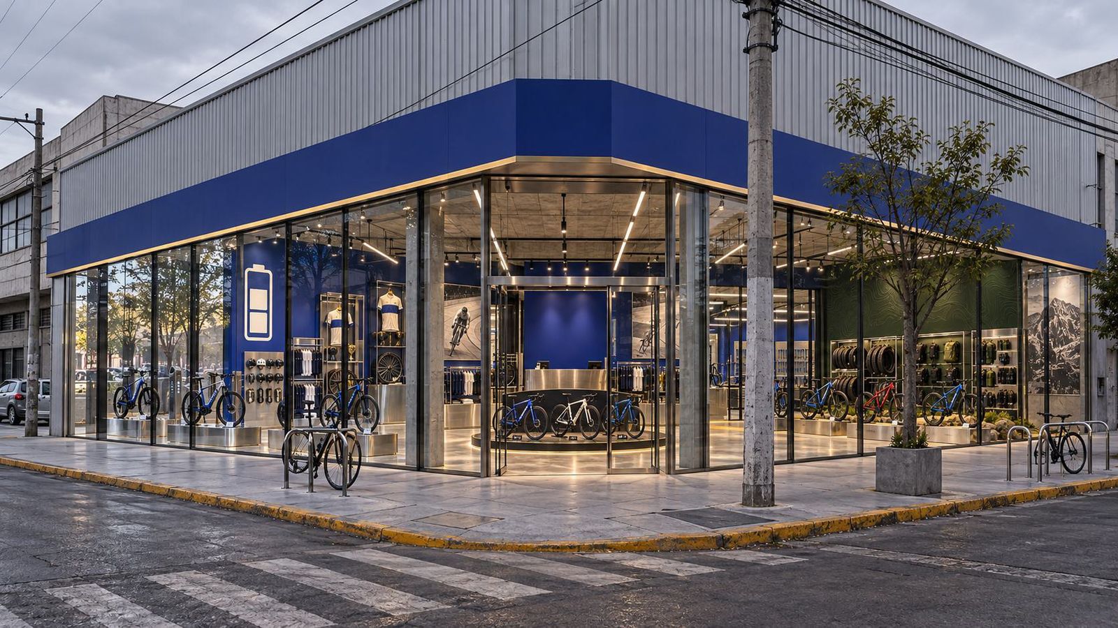
26 tiendas
Desde 1931
Fondata a Torino
da Giacinto Benotto
Récord mundial de la hora · 10.10.1968
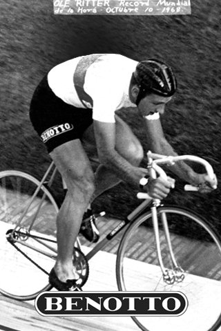
48.653 kmen una hora.
Ole Ritter lo rodó en una Benotto, en la Ciudad de México.
Benotto’s customers are not one person. The racer, the mountain biker and the city rider want different things from the same shop, and the old catalogue spoke to all of them in one voice: the price.
So the system works in two layers. The house signs everything: the eagle, Benotto Blue, the script, Eagle Gold at about five percent and never as text, Neulis for the voice and DM Mono for the data. Each line then gets a world of its own — a tagline, a photographic language and a graphic signature that never travels to the other two.
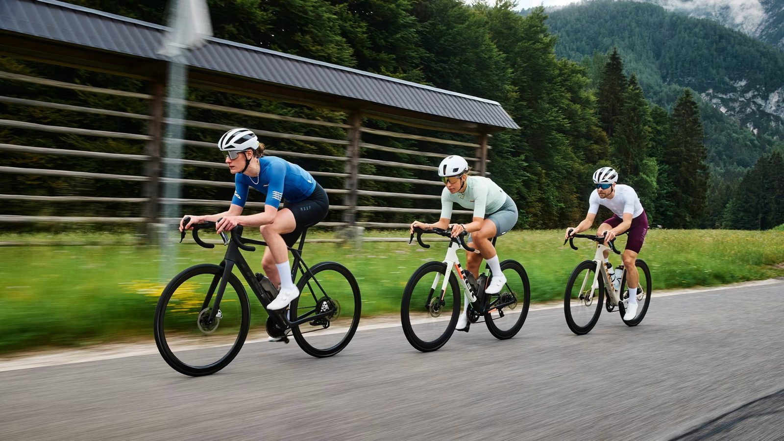
Línea 01 · Ruta
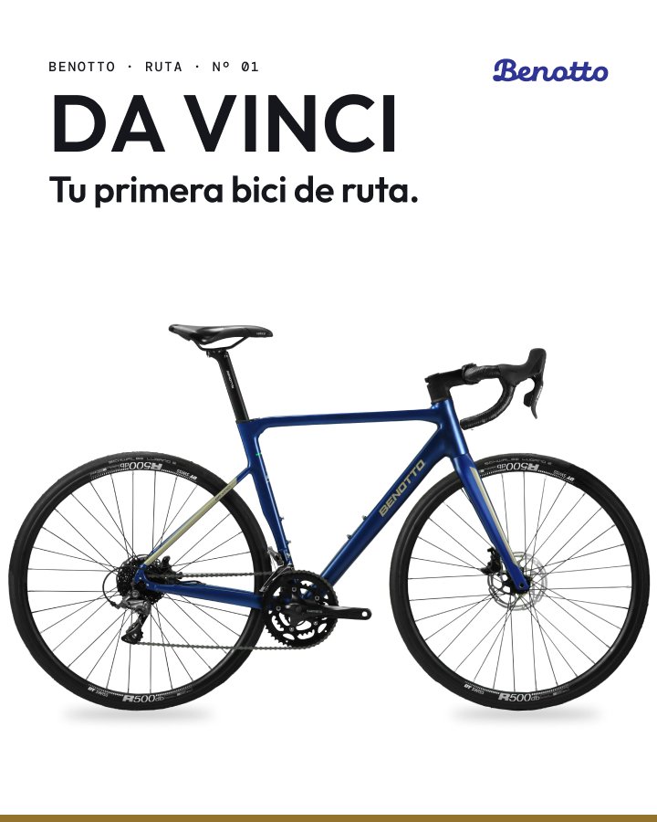
Bicis de ruta de la casa que rodó la hora más larga.

Línea 02 · Montaña
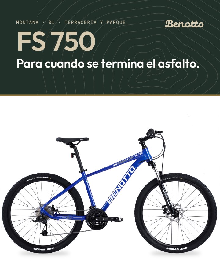
Bicis de montaña para cuando se termina el asfalto.
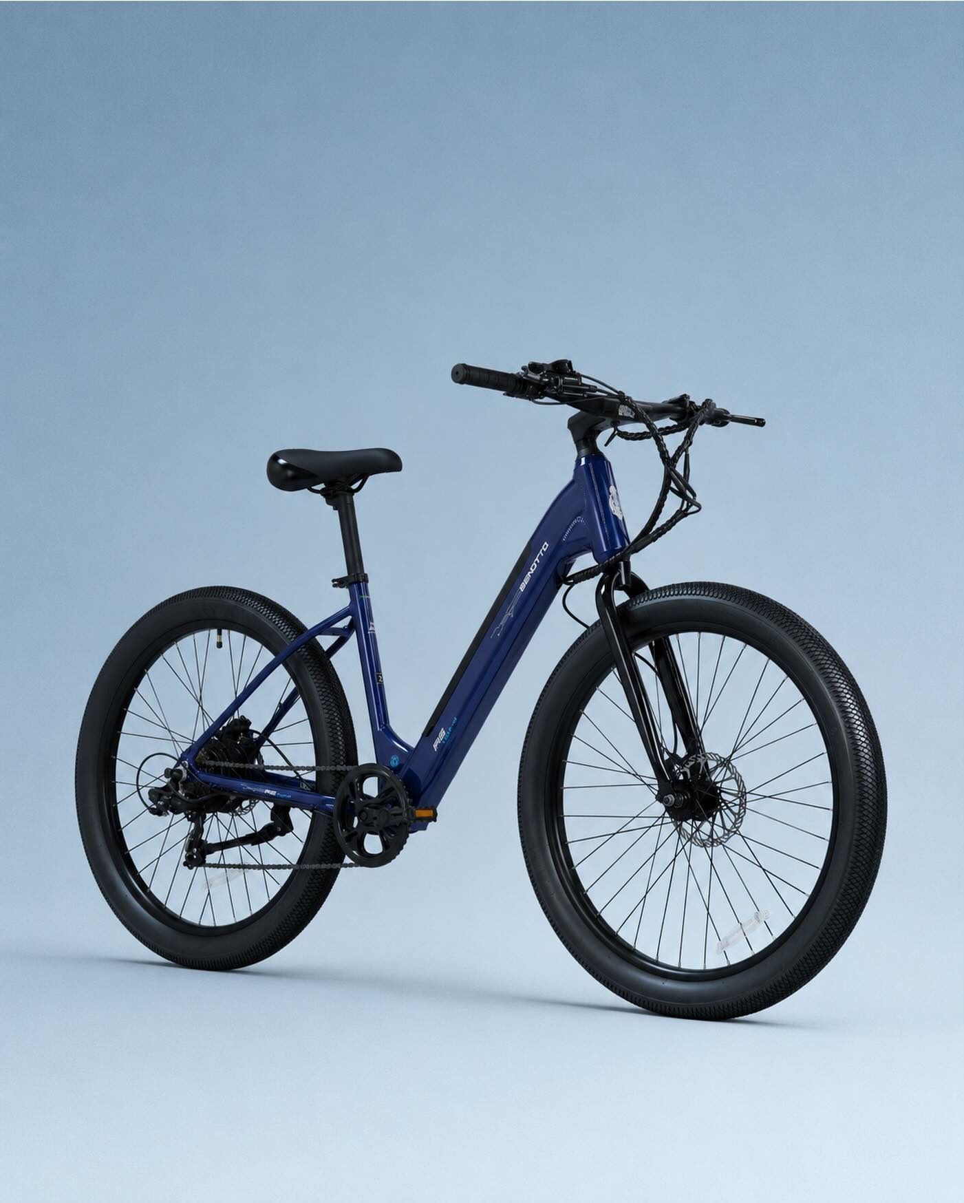
Línea 03 · Línea E
Cinco bicis eléctricas, una para cada carga de tu día.
benotto.com today only redirects to the online store. The first decision was to turn it into the brand’s home, with the store as one section of it. Getting there took five rounds in Figma, and each one fixed something the previous one got wrong.
The first round borrowed the campaign’s condensed type and invented a heritage city bike to carry the story; it read like an ad. The second let photography lead and used a real flagship, the Da Vinci. By the fourth, the structure that stuck was in place: a house home page that opens three doors, with a world of its own behind each one. The last round swapped the electric line’s battery for its new graphic, and then the site left Figma as a working prototype.




Scroll inside each phone
Swipe →

The first proposal for the launch gave each value its own poster, in a condensed face borrowed from sports ads: “Alma de artesano”, “Nadie rueda solo”, “Escápate”, “La ciudad es tu pista”, “Mueve a México”. It looked strong and said little that another brand couldn’t say.
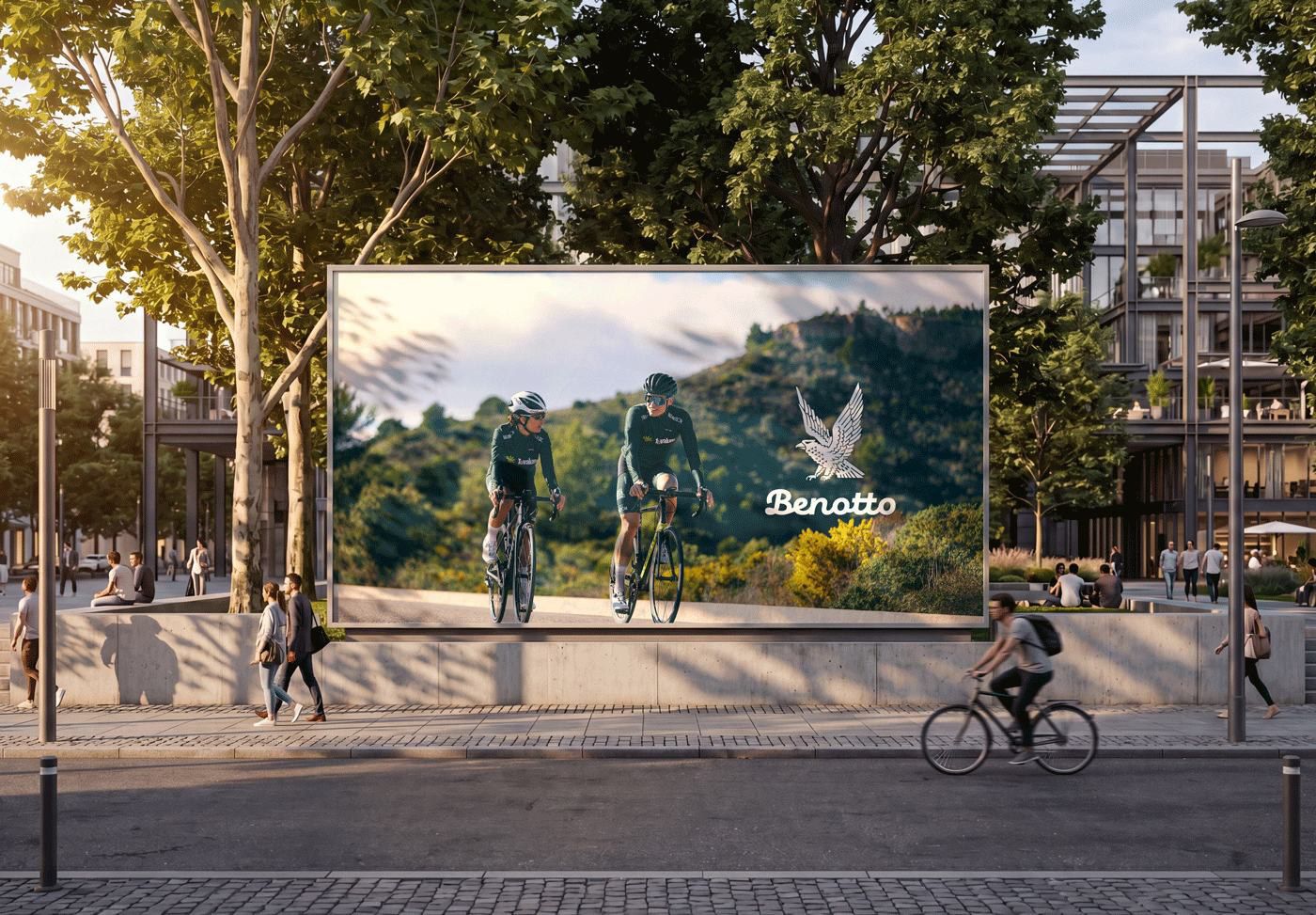
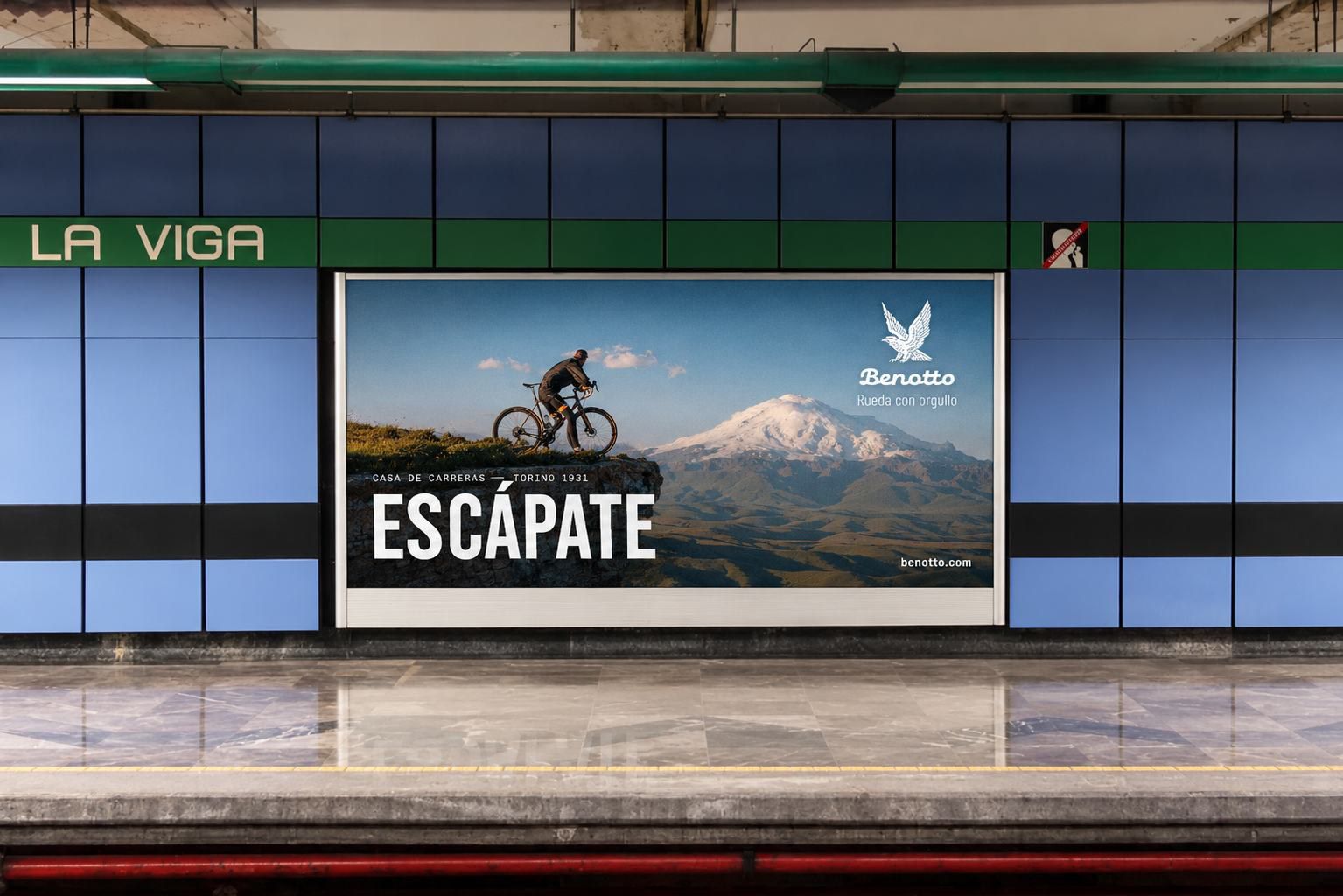
The second proposal keeps the idea of a first contact and moves it onto the brand’s own system and its own archive: Ritter’s 48.653 km, a period photo of a Benotto team, and the line every Mexican can finish themselves, “Tu primera bici fue una Benotto”. Each concept comes in three formats, from the Instagram post to the metro platform, with one rule: black-and-white archive photography, the white lockup, the gold rule underneath.
En México desde 1952
La siguiente también.
Récord mundial de la hora · 10.10.1968
en una hora. Ole Ritter lo rodó en una Benotto.

Casa de carreras · desde 1931
Lo aprendimos en el pelotón.
Swipe →
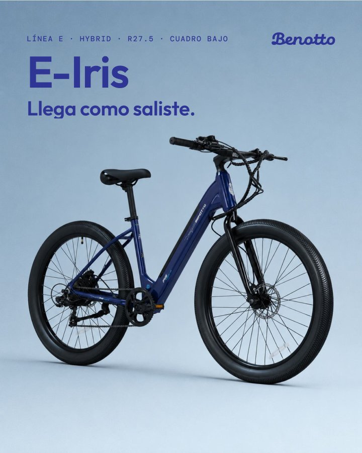
One profile instead of four, signed with the white B. Each line gets a cover per model and a carousel that goes from the full bike to the details anyone can check in store — the disc brake, the gears, the battery in the frame — and ends with the same invitation: try it before you decide.
Línea E launches with a four-week plan: three teaser stories, a carousel for the line, then one model a week, each with its own reason to exist. “Carga” works twice: the battery that charges, and what you carry every day.
Swipe →
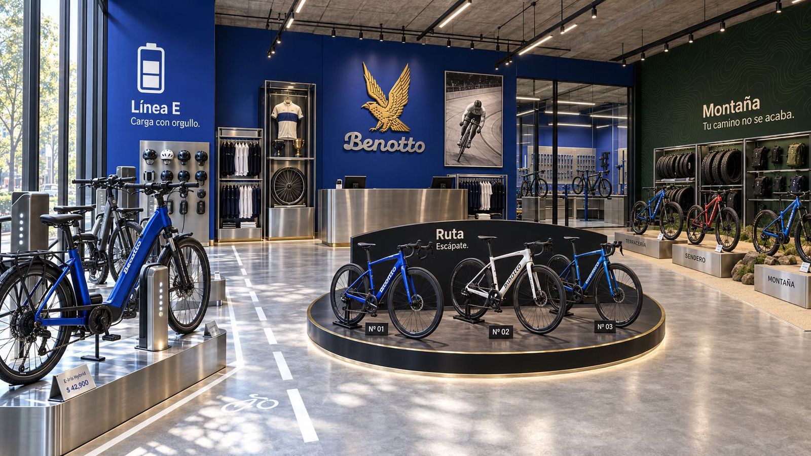
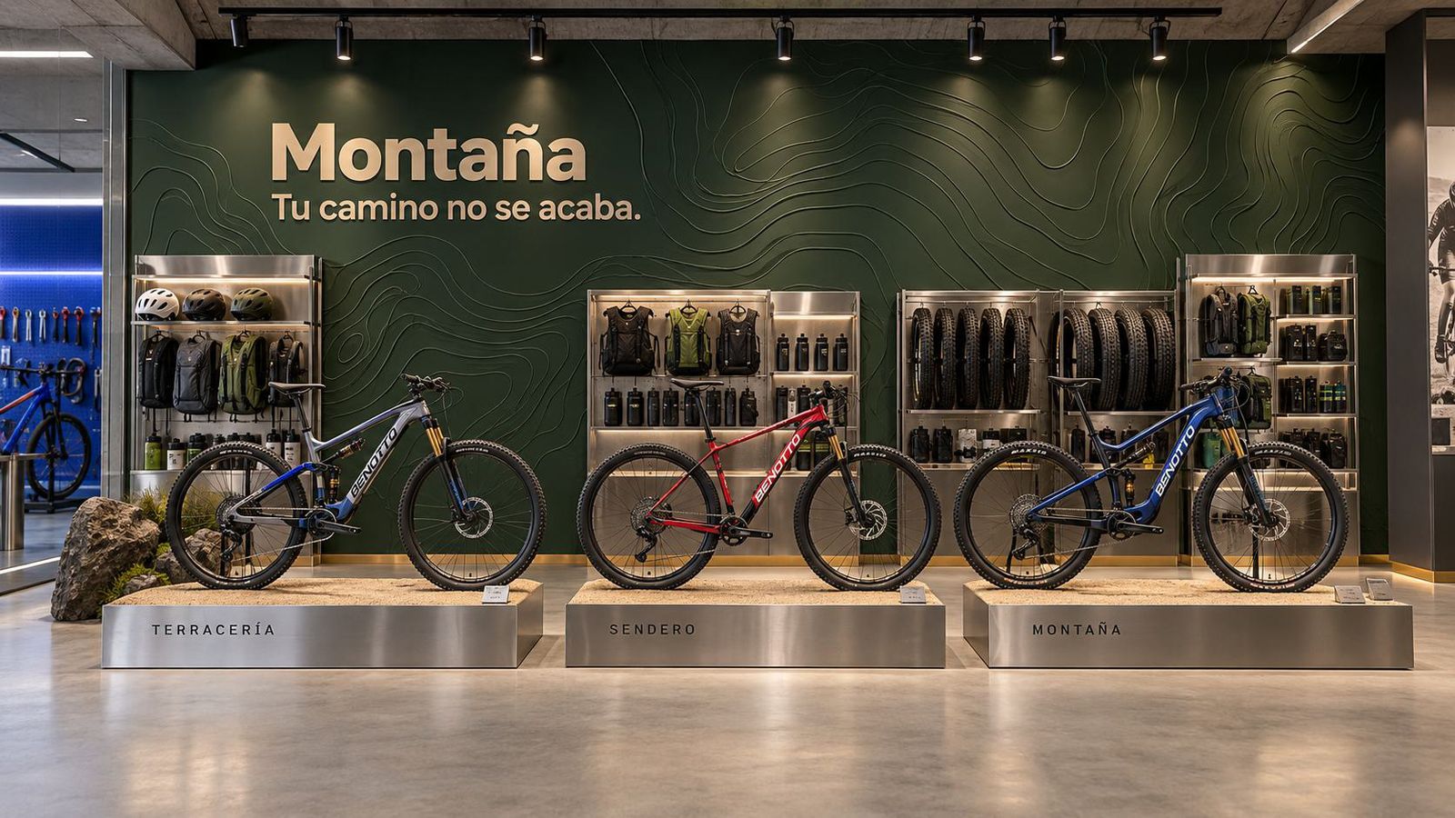
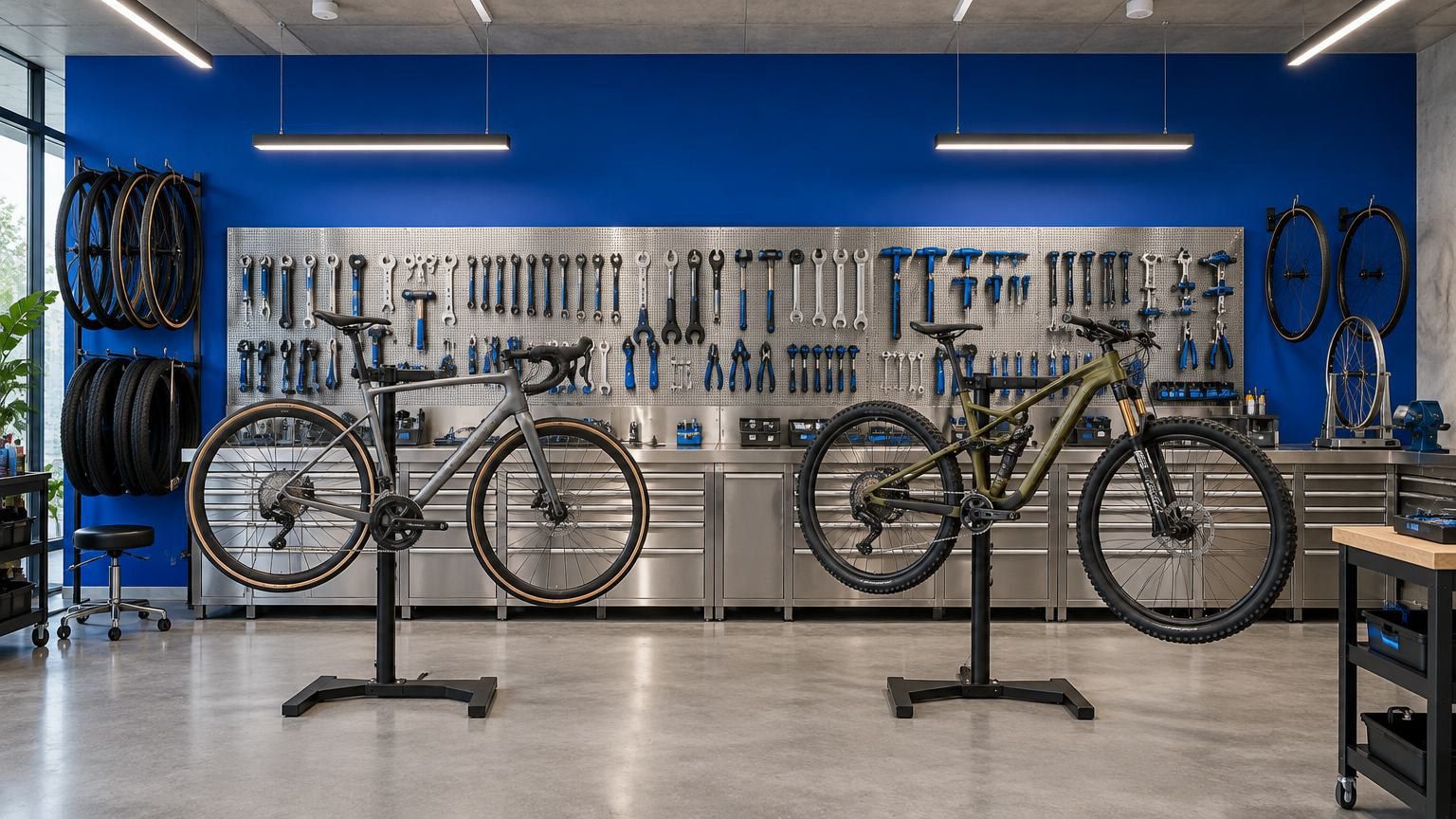
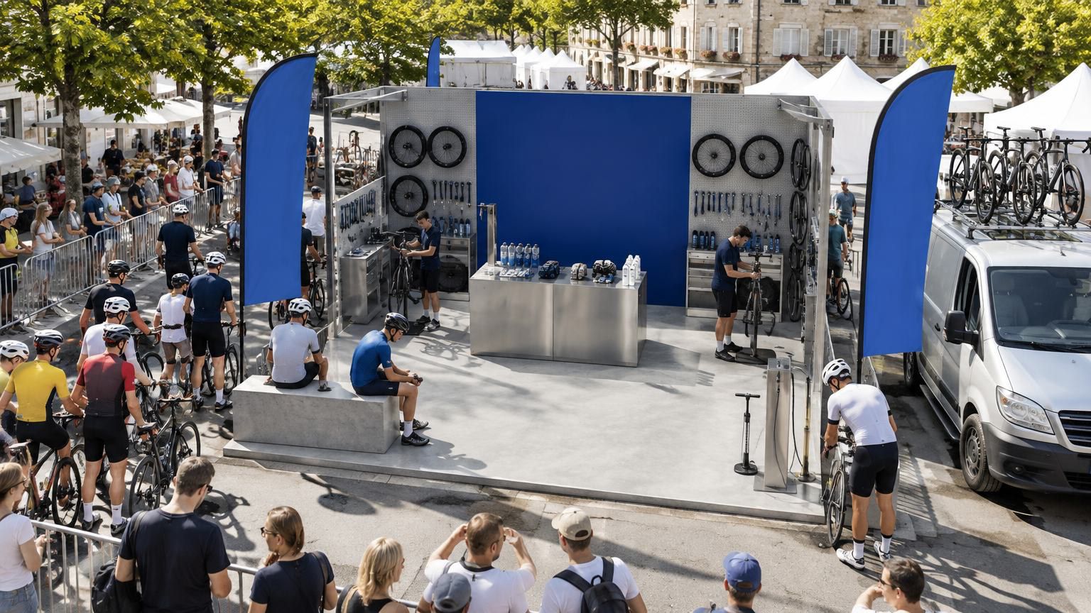
The store has to do offline what the website does online: tell the story without a word. Forty-three mockups explored six directions, from façades to interiors to the events outside, and every one was rated on the same six criteria: brand colour, the four values, standing apart from Decathlon, Trek or Mercurio, premium, welcoming for a city family, and cheap enough to roll out to every branch.
The matrix pointed to one combination: the blue-stripe façade with the Benotto Blue and steel interior. It is the only one recognisable as Benotto without reading the sign, and it is an evolution of today’s branches, not a break. It also borrows the best of the others — the glazed workshop behind the counter, the lit bike wall, wood on tables to warm the steel — and adds what the renders lacked: the eagle, a zone per line, and white lettering that holds its contrast on blue.
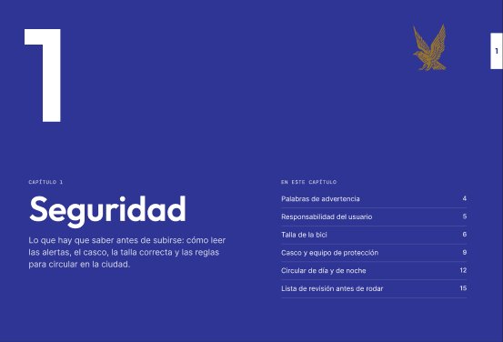
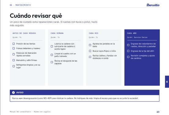
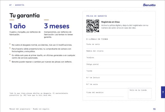
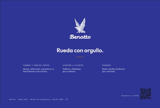
The manual is the first thing a customer reads after paying, and today it is a 72-page translated technical document with the old logo. The proposal keeps its content and its 210 × 143 mm format, so the printer doesn’t change, and moves it onto the system: chapters with a colour and a number, warnings that follow the ANSI Z535 standard, numbered steps beside each figure, and a quick-start sheet that sits on top of the bike in the box.
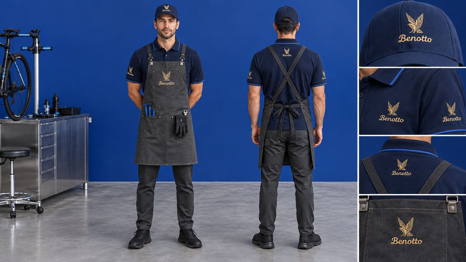
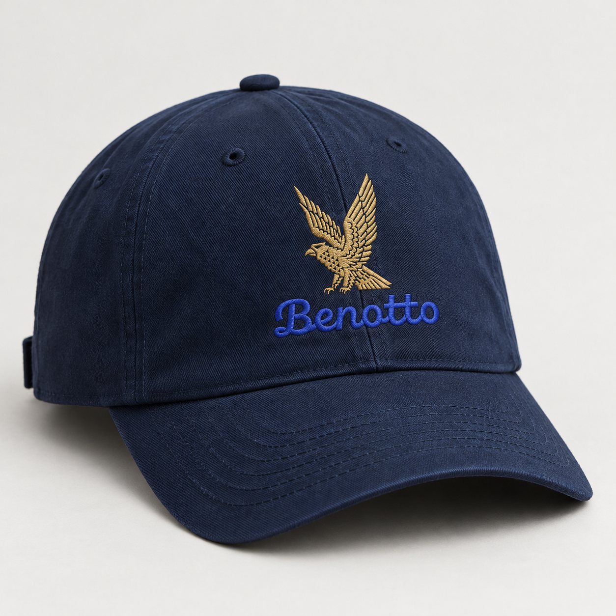
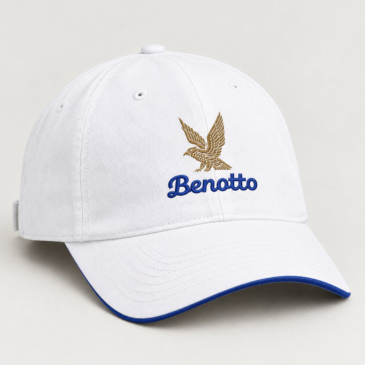
Price tags follow the same ratio as everything else: steel and white, blue for the brand and the price, gold only when there is an offer, and the total with tax always visible. Merch comes in two kits: one for the workshop and the counter, one for the Sunday ride.
Benotto doesn’t need a new story. It needs to tell the one it already has.
A solo course project. Benotto is not affiliated with it; everything shown as new is a proposal, and product photography belongs to Benotto.
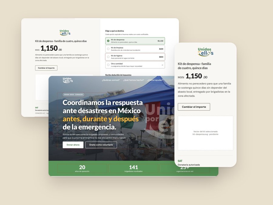 Unidos por Ellxs
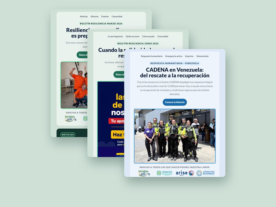 ARISE MX Newsletter
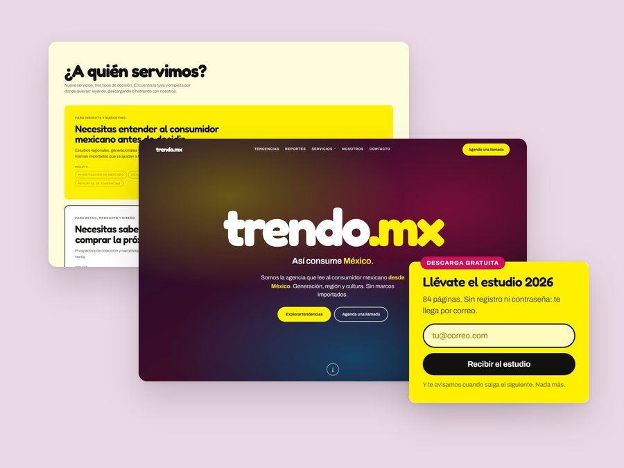 Trendo.mx
 Doctor, doctor!?